Hello peeps! I’m Ghassani Ghina Amirah, call me Mia. I want to represent my team UX case study regarding Kitabisa, which is crowdfunding platform. Luckily this platform having same layout UI on mobile application and website.

Kitabisa is one of the largest crowdfunding platforms in Indonesia. User can use this platform to do fundraising for various purposes. Most of the purpose is for medical needs. However, user can also do fundraising for several categories such as natural disasters, education, environment, social activities, humanitarian and others.
Kitabisa wants to redesign and even revamp or change the “News” section which can find through the Inbox menu in the menu navigation and then look at the News section next to the Messages section.
This feature is the way of distributing information from campaigns user have donated. Then, the information provided can also be related to similar campaigns so that users can re-donate in other campaigns. Our goals are as follows:
In this project, I’m a part UI/UX Designer of team 3, We have Giosanera, Refsam, Safitri Herdian R, Ahmad Irsyad Hidayatulloh, include myself. All design process we discuss and work together. “Alone we can do so little; together we can do so much.” — Helen Keller.
Gender : All gender
Age : 25–35 years
Profession : unspecific
Living in Indonesia
Mother tongue : Bahasa
Good knowledge of technology
Interested as donor
Google Docs, Google Spreadsheet, Figma.
In this project, we used Design Thingking as Design Process based on Skilvul theory.

Step 1 — Empathize
This step we are positioning ourself as a user to find Pain Poin and How Might-We. We collected data regarding problem and needs user as user position. We do some research are: Secondary Riset, AMA Sesion from previous batch, Qualitative method, Analysis Competitor, Feedback from user in Playstore, Medium platform.

Step 2 — Define
Then, we need to made a list of Pain-Points and How-Might We by using Figjam to make the next step easier.
In Pain-Points step, we need to list down the problem while using the platform.

Next, in How-Might We part we need to find the solution from the problem which we list down before. After that, voting three (3) best solution to proceed next step, there are:

Step 3 — Ideate
After we got Pain-Points and How-Might We, we can find the best solution with some ways, such as Solution Idea, Affinity Diagram, and Prioritization Idea.In Solution Idea part, we made some solution to solved the issued such as:

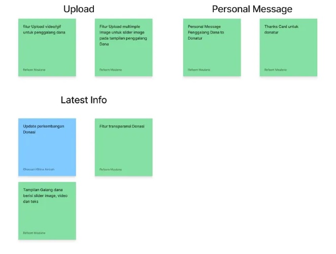
Next, we classification by using Affinity Diagram in to different class, they are, upload, personal message, lastest info.
Then, we go to Prioritization Idea which mean we separated the idea from low value and low effort to high value and high effort. Our team prefer implementation the low effort but high value.

Next step is User Flow, we made it to guide hows the flow of the application while user using it. There are personal message, progess of donation, and lastest info.

Then Wireframing step using Figma, we created a Low-Fidelity (Lo-Fi) Interface for this process.

After that we proceed to Design System. This step to made UI component to easier our work such as, colour, typography, icon, button.

Step 4 — Prototyping
After we completed step 3, we moved forward to Prototyping which mean High Fidelity (Hi-Fi) Interface and already connected to each other frame, and the link below will be shown the demo.
Step 5— Test
In this part, we made a survey regarding usability testing in prototype to test our work. Are our prototyping solving the problem? or how? We do usability testing using Single Ease Question and Survey.
Some question fos this session:
Result
We got seven (7) responden for this testing. By using Single Ease Question and Survey we got some result.

Conclusion
Based on result of Usability Testing using Single Ease Question (SEQ) method, the result is good. Most of them giving rate very easy, other than that they giving hard due to the responden not to familiar from Kitabisa.
Note:
This is link of our presentation
https://bit.ly/3EwtVuu
Disclaimer: This project is a part of assignment the UX Case Study organized by Skilvul and Kitabisa as Challenge Partners. I’m from Batch 3 Team 3 who want to explore knowledge to complete this challenge and scholarship of Professional Academy Kominfo Digital Talent Scholarship Batch 3 2022 — August to Ocotober: UI/UX Design Mastery (Intensive Class).


A stunning design can captivate and amaze, drawing people in with its beauty and creativity.


